First
Up & first to market. Inspired by lightness and the effortless rise of a balloon.
The client
 First LLC
Brand identity for a B2B startup reimagining corporate cold outreach, bringing clarity, colour, and confidence to a market saturated with automation noise.
Evolution services
- Brand FoundationsStrategy, positioning and a complete identity system. The brand built from the ground up.
Up & first to market. Inspired by lightness and the effortless rise of a balloon.
The client
First LLCBrand identity for a B2B startup reimagining corporate cold outreach, bringing clarity, colour, and confidence to a market saturated with automation noise.
Evolution services
- Brand FoundationsStrategy, positioning and a complete identity system. The brand built from the ground up.
Up & first to market. Inspired by lightness and the effortless rise of a balloon.
Brand identity for a B2B startup reimagining corporate cold outreach, bringing clarity, colour, and confidence to a market saturated with automation noise.
The client
First LLCEvolution services
- Brand FoundationsStrategy, positioning and a complete identity system. The brand built from the ground up.
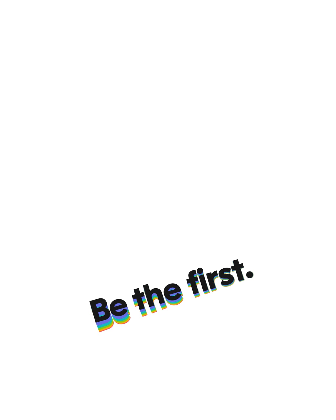
In a market full of noise, be the message worth opening.
B2B cold outreach is a sea of automation and templates. First set out to reimagine it, and to do that the brand had to feel human where everything around it feels robotic. Clarity instead of clutter. Warmth instead of scripts.
In a market full of noise, be the message worth opening.
B2B cold outreach is a sea of automation and templates. First set out to reimagine it, and to do that the brand had to feel human where everything around it feels robotic. Clarity instead of clutter. Warmth instead of scripts.
Up and first.
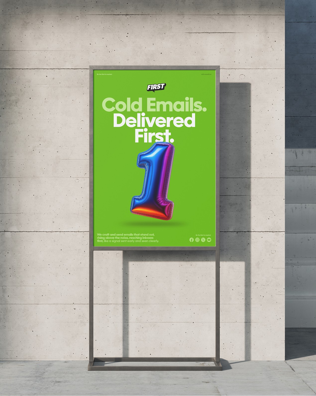
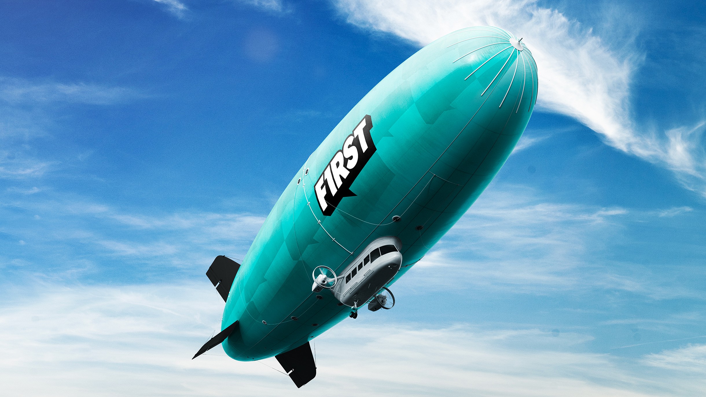
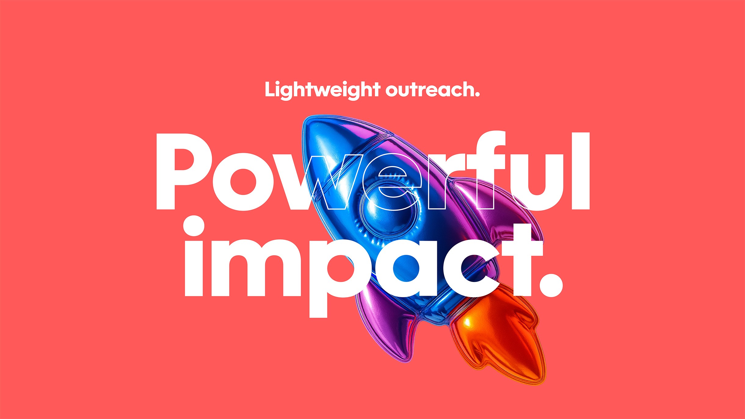
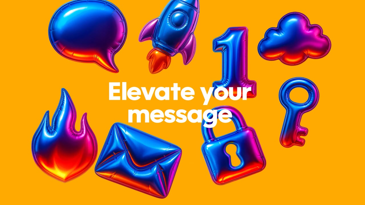
We built the idea around a balloon: lightness, movement, the effortless rise above the crowd. A system that lifts, in look and in language, and lands the name in a single gesture. This brand doesn't push. It lifts. It floats. It leads.
Up and first.
We built the idea around a balloon: lightness, movement, the effortless rise above the crowd. A system that lifts, in look and in language, and lands the name in a single gesture. This brand doesn't push. It lifts. It floats. It leads.

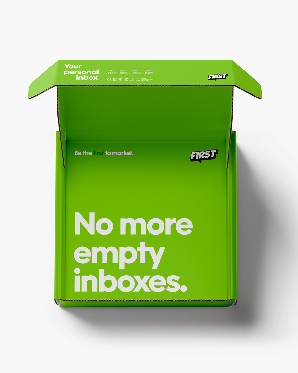
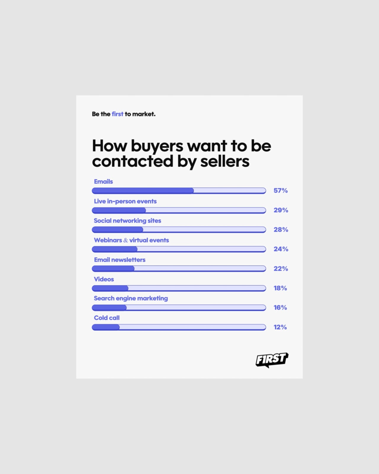
Light on its feet, precise in its voice.
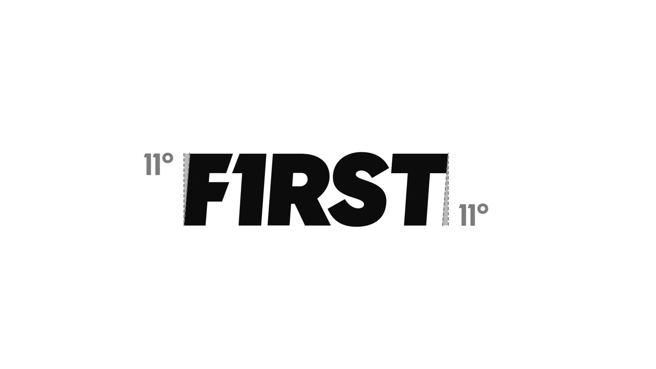
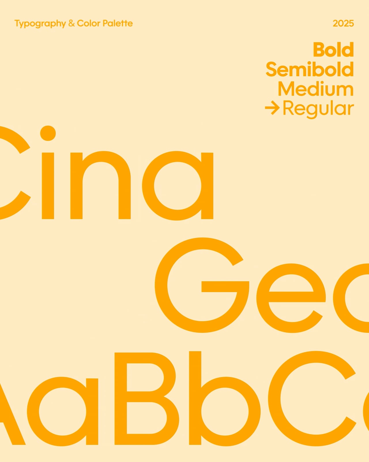
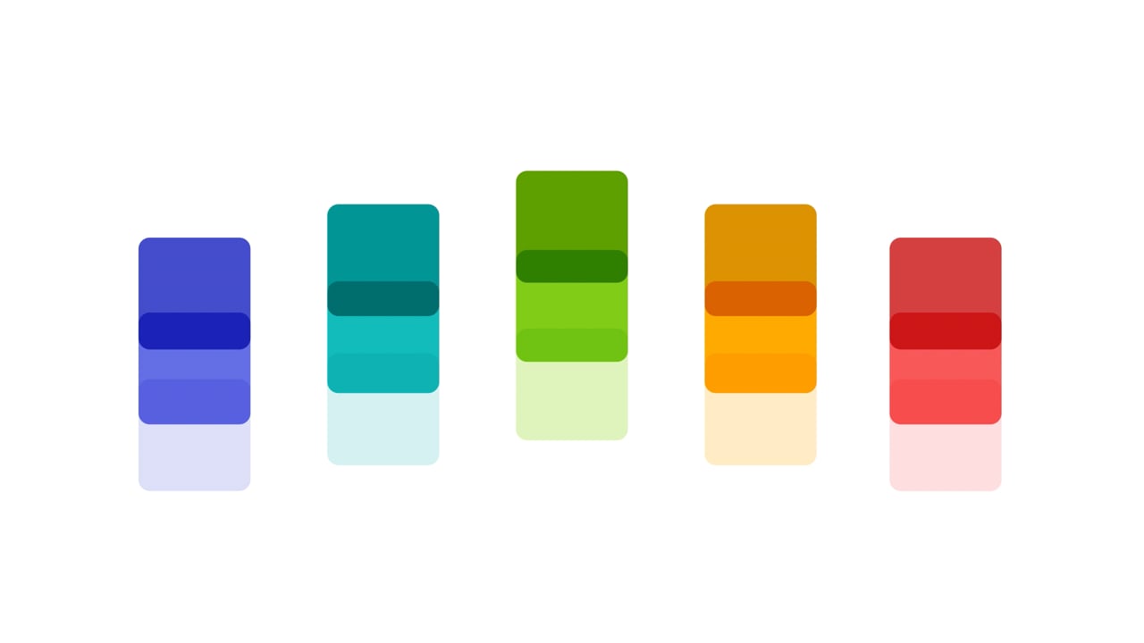
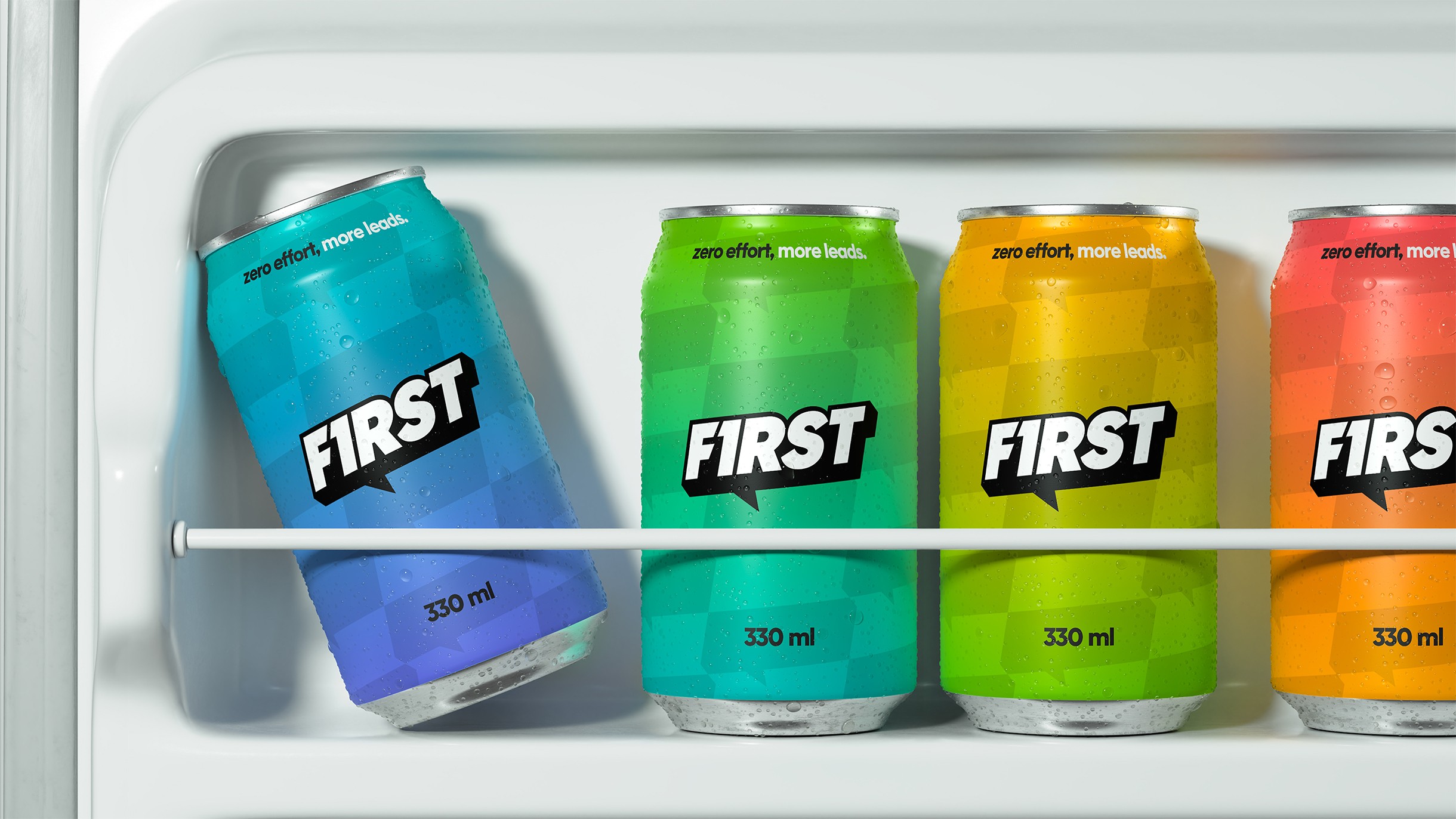
A 3D logotype with a floating aesthetic, a vibrant palette built on gradients, and a visual language of motion and momentum. Paired with a tone of voice that keeps it simple and exact, so the lightness never reads as lightweight.
Light on its feet, precise in its voice.
A 3D logotype with a floating aesthetic, a vibrant palette built on gradients, and a visual language of motion and momentum. Paired with a tone of voice that keeps it simple and exact, so the lightness never reads as lightweight.
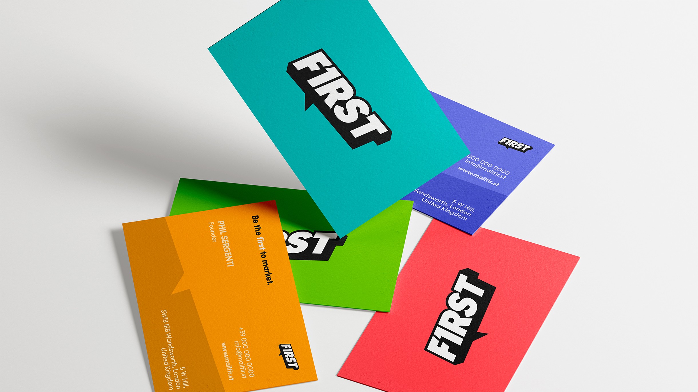
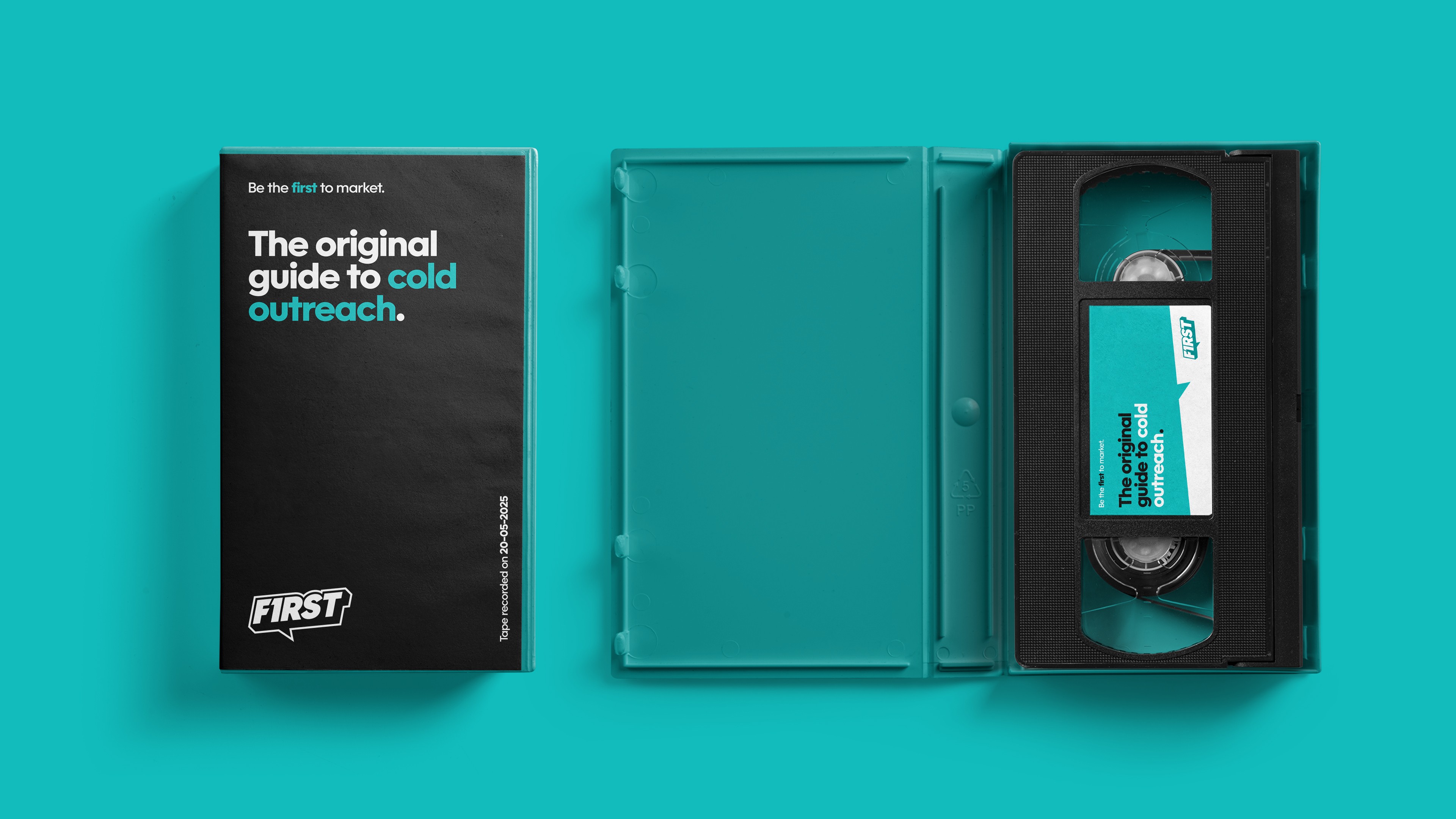
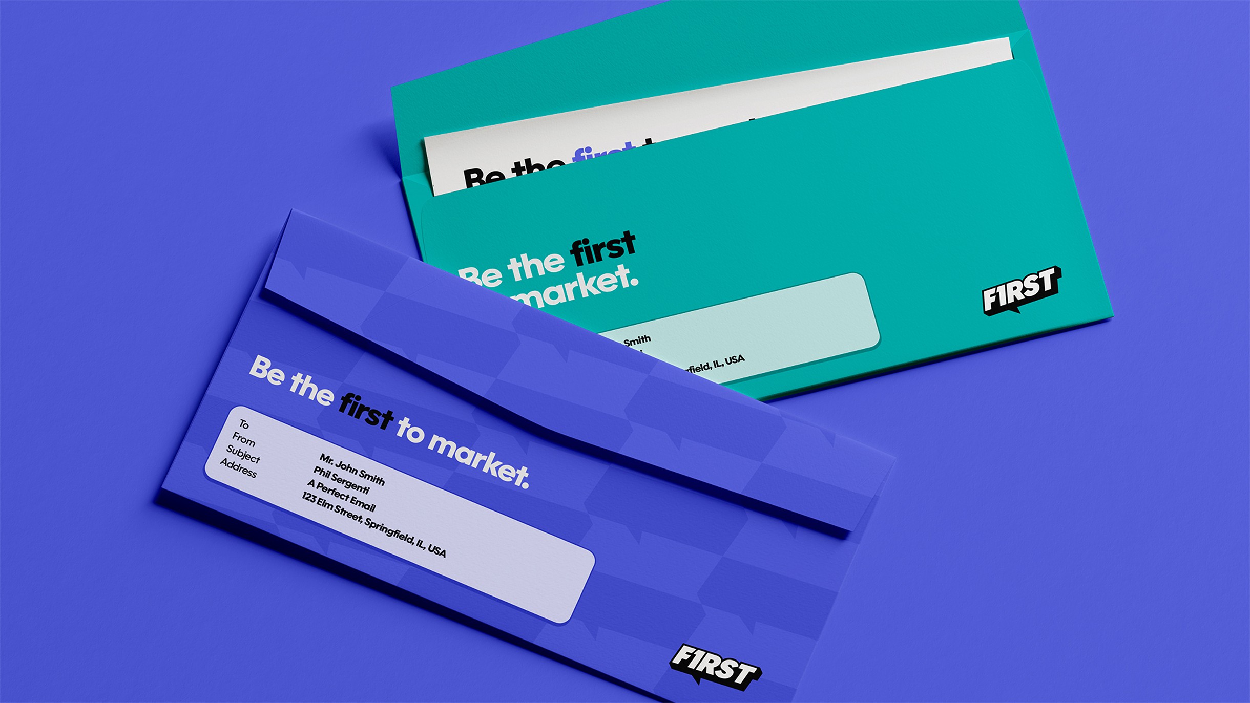
The first message worth opening.
First launched with a motion identity and a way of speaking that feel effortlessly clear, direct, and unmistakably first.
The first message worth opening.
First launched with a motion identity and a way of speaking that feel effortlessly clear, direct, and unmistakably first.
The people behind the project
The people
behind the
project
Marco Gabanelli
Creative Direction & Visual Design
Nicola Pezzotti
Art Direction & Visual Design
Liana Bonanno
Motion Visual Design
Next project
Forme Studio